


Primary colors predominate in the bank’s corporate identity, they are used in the logo, brand name and what are the main colors in the identity, the combination of blue and light blue helps the brand in recognition as a kind of “trick”.
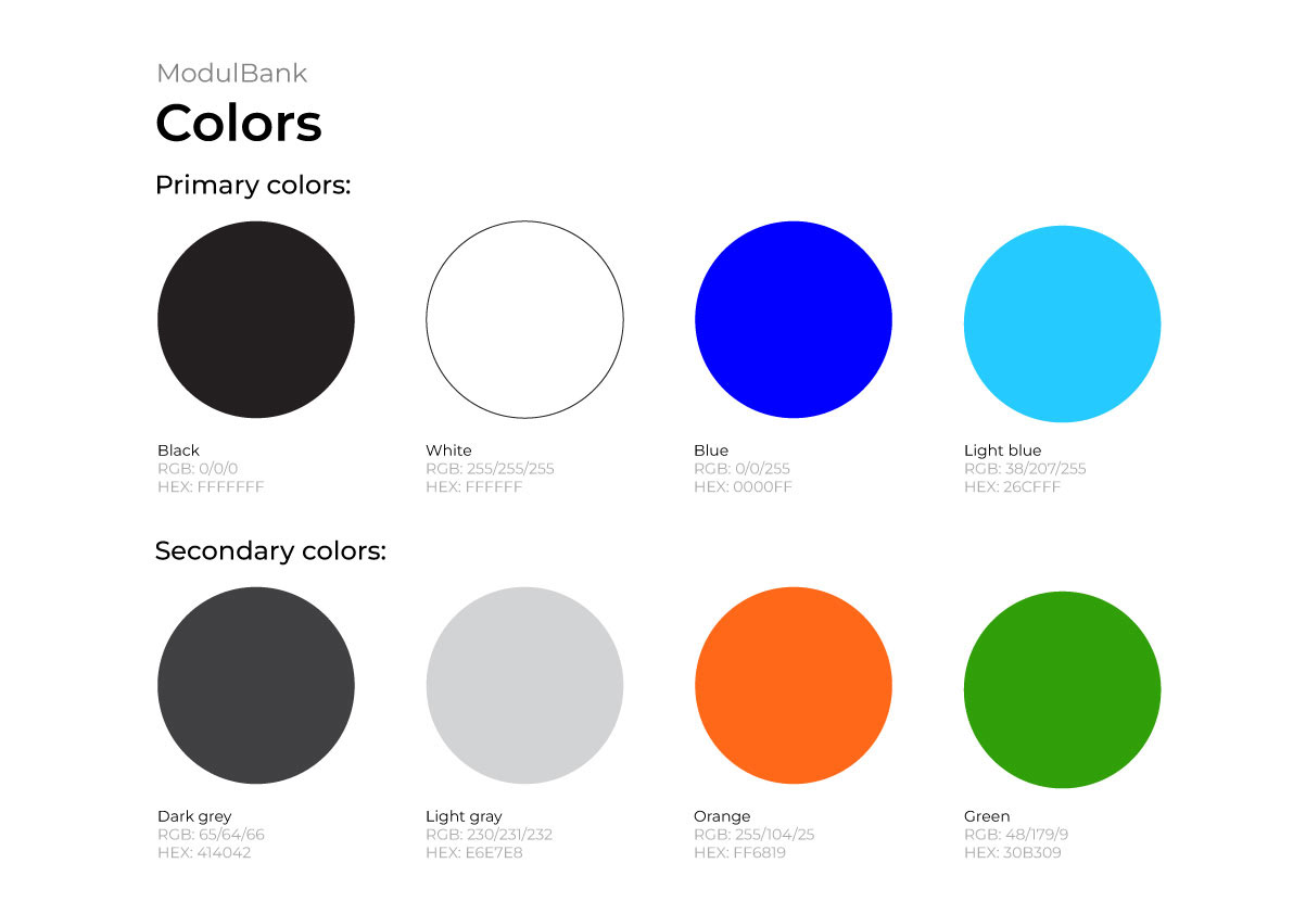
Also in the bank’s identity there are 4 secondary colors, which are used as an addition to the main ones. For example, in banners, posters, social networks. Bright colors dilute the tonality and add mood, and can also identify individual services.
For example, “ModulCheckout” is designed in primary colors,
but with the addition of green, which helps without difficulty distinguish it from the rest.
For example, “ModulCheckout” is designed in primary colors,
but with the addition of green, which helps without difficulty distinguish it from the rest.


You can contact me for cooperation
telegram: elizaxzf
instagram: elizaxzf or use the chat Behance
I would love to hear your opinion and comments! Thank you :)
I would love to hear your opinion and comments! Thank you :)


